What does mobile-first UI design mean for companies in 2020?

Statistical data show that 3.2 billion people, that is a staggering 41% of the overall global population, use mobile devices to access the internet. It is predicted that by 2025, that number will incrementally rise to 72.5%.
The base conclusion out of this data is obvious: if your web presence is not designed for mobile, you and your users are in trouble. That’s why designing a user interface (UI) for mobile-first is the only strategy to employ for all online products, be it websites, apps or whatever runs digital.
Let’s dive into the topic:
What is mobile-first design?
The Mobile-first design process isn’t really a process, but rather a philosophy. This philosophy aims to create better user experiences for users by starting the design process from the smallest of devices: Mobile.
Leveraging this design philosophy ensures that the user experience on such mobile devices will seamlessly translate on any device.
In practice, this means that a designer prototypes a layout starting from the smallest of all screens. Then they move on to larger screen resolutions. Sketching a desktop layout in the Mobile-First approach comes last.
Historically, the mobile-first design concept was first introduced in 2010, when Eric Schmidt, then-CEO at Google, announced [1] at a conference that the company would, from that moment on, be focusing more on mobile users in their design practices.
What’s really important right now is to get the mobile architecture right. Mobile will ultimately be the way you provision most of your services. The way I like to put it is, the answer should always be mobile-first. You should always put your best team and your best app on your mobile app.
Schmidt’s reasoning behind this is straight forward: Screen real estate on Mobile Devices is limited. The logic is simple: when designing for a smaller screen you can only fit so many elements into it as there is space to hold. That means designers choose to include only what’s most important, or what users need the most. Anything else should be ignored.
As design expands into larger screens, designers can afford to include further elements, always prioritizing what is needed most to achieve the most subtle user experience.
Why is mobile-first design important?
According to Statista [2] in 2020 there will be a projected 3.5 Billion users using the internet from their mobile devices. In this case, it is purely a matter of numbers to adopt mobile first design approaches.
Number of smartphone users worldwide from 2016 to 2021 (in billions)

Source: Statista
A tip we’d suggest you are having a look at. Google favors mobile-friendly designed websites. They expand on the topic:
Getting good, relevant answers when you search shouldn’t depend on what device you’re using. You should get the best answer possible, whether you’re on a phone, desktop or tablet. We started using mobile friendliness as a ranking signal on mobile searches. We’ll start rolling out an update to mobile search results that increases the effect of the ranking signal to help our users find even more pages that are relevant and mobile-friendly.
Directly translated, Google’s statement above means: By providing a good user experience on mobile, the discoverability of websites is increased, which directly impacts conversion rates. Aside of discoverability, user experience offers a plethora of opportunities which we’ll discuss further on.
Mobile-First and accessibility are synonyms, and there is a design overlap between the two terms:
- Small-screen friendly. Mobile-first design pushes you to make your digital products more readable on smaller screens—and therefore more accessible to people with a reading disability. And when your designs help people with limited vision, they’ll also help everyone else. The classic expression “Rising tide raises all ships.” fits this case the most.
- Information hierarchy. Mobile-first is a synonym to content first. The most important content assets should be put at topmost position on your page. This would also make content directly accessible to people with a cognitive disability.
Things you should know about mobile-first design
#1: Mobile-first is equivalent to Content-first
Content is the key factor, remember this. Users should be getting all the content they’re looking for, and this is about all they should be getting. Anything else than pure content will most certainly clutter the user experience and distract from the actual requirement, the users’ experience.
The biggest constraint designers face is the screen size they must work on. This requires taking a good look at the content, and how this same content is presented in a visual hierarchy.
After all, designing for mobile devices comes with a big constraint in screen sizes. That means you need to look at all your content and present it in a visual hierarchy depending on how important it is to your user. Only then you can fit the most important elements.
Finally, let’s have a look at an example from the Chicago Tribune [3] mobile website—one of the first newspapers to implement mobile-first design back in 2014.
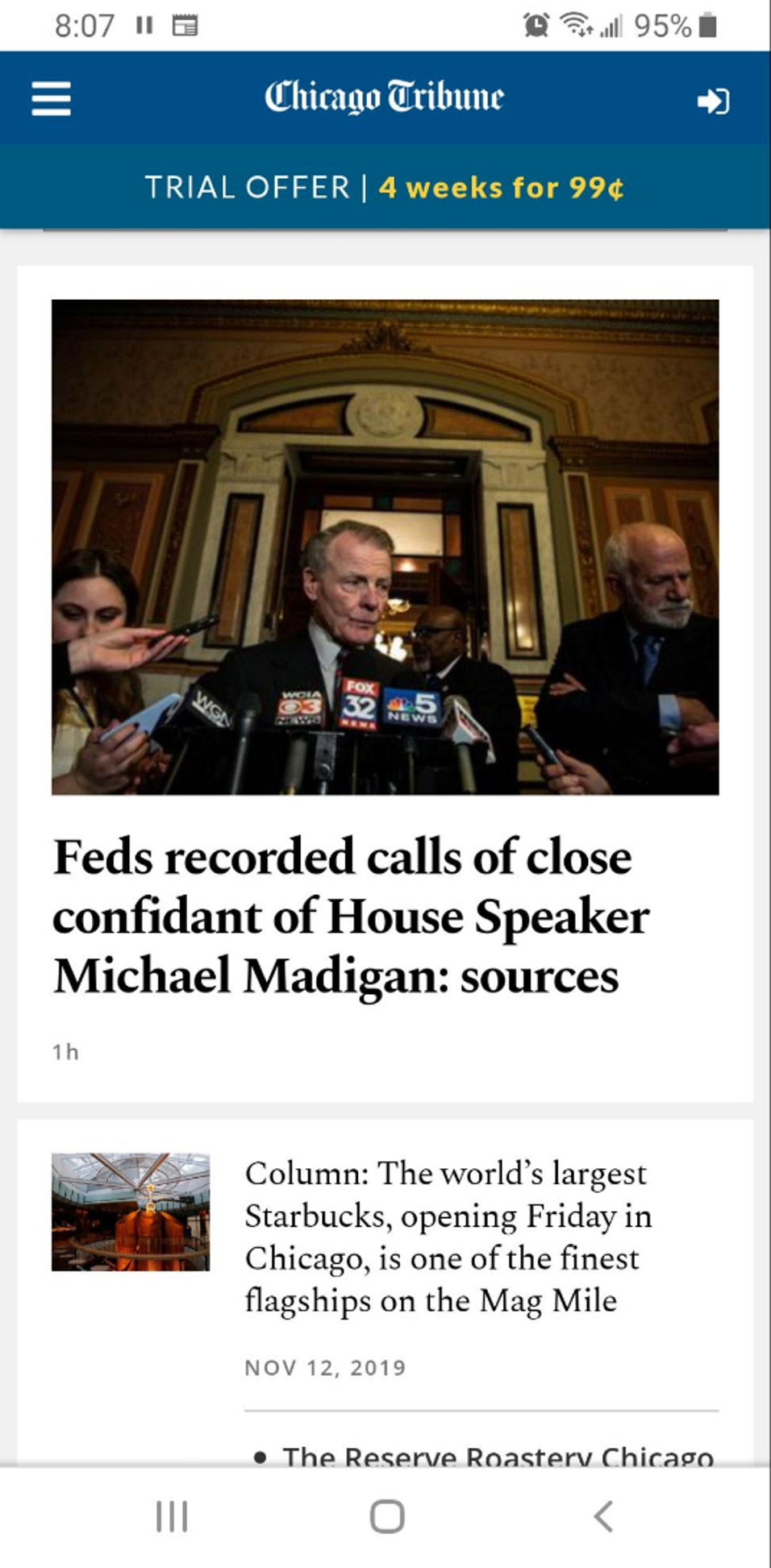
Most likely there will be certain things which you may notice:
- The Newspaper’s name is up top. This is key in the visual hierarchy. It lets the users know where they are and orientates them to the Chicago Tribune’s website and content. Your brand’s logo and name will likely always go on top of any mobile design.
- Users see news right away. The Chicago Tribune goes all-in on content-first. Most users aren’t coming to their website to check out the about page or privacy policy. They want to read the news, so the newspaper gives it to them.
- Easy-to-reach navigation. The Tribune website stores any extraneous (or less important) content in the hamburger menu up top. That way, if there’s something the user wants to see that isn’t on display right away, they can easily find it there. There is a caveat to this—but we’ll dive into this further down.
This is ultimately a great example of knowing your website’s visual hierarchy and using it to create a great mobile-first design.
#2: Ease of Navigation
Navigational elements need to be grouped into easy to reach navigational menus. The common navigational practice is the hamburger menu. These menus are recognizable elements by the user and give access to less important elements. Users know how to use the hamburger menu and find what they’re looking for.
Sometimes, however, the usage of common elements can lead to lower engagement. According to a study carried out by the research firm Nielsen/Norman Group [4], hidden navigation buttons like hamburger menus decrease content discoverability by 21%. Fortunate enough, experienced user Interface designers know that there are ways to extend the plain hamburger with so-called combo navigation.
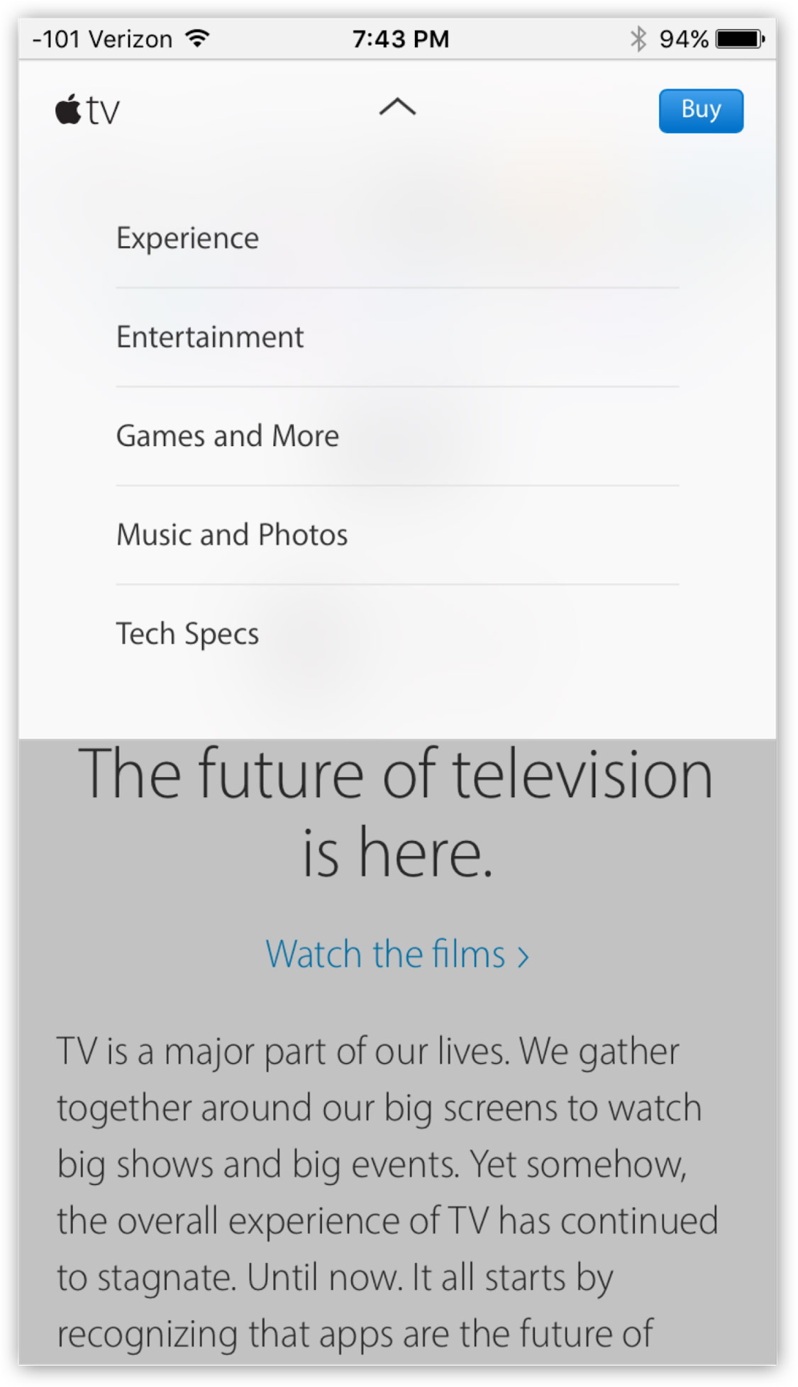
One great example comes from Apple’s mobile page where, instead of implementing a hamburger menu that hides options, Apple utilizes combo navigation to present the most important links (“Buy” and “TV”) as buttons.
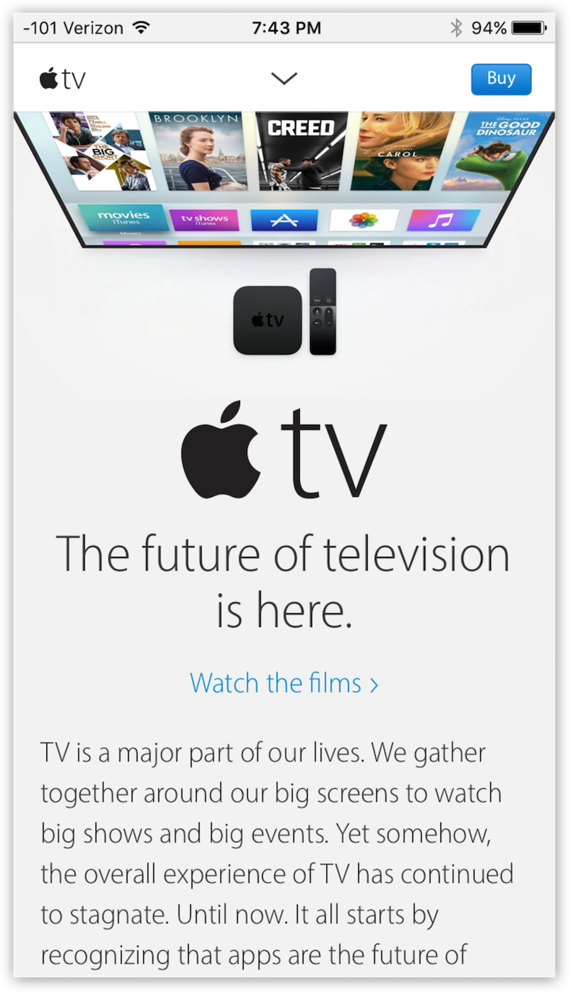
If you can’t find what you’re looking for, you can always use the navigation button on the top to access more options.
#3: KISS (Keep it simple, stupid)
KISS has been around for decades, and it is the base principle applied by a good UIUX designer. The main target of design should not be to add additional hassles to users. Ads, Pop-ups and any distracting content should be avoided. The user should get exactly what they came for.
Always keep the user in mind
At the bottom line, your most valuable assets are the users that visit your website, or use your mobile apps. CodeCoda provides experienced UIUX designers to take on your designs and upgrade the user experience of your digital products. Our skilled user interface designers will take you from ideation to final product….
References:
- Eric Schmidt, CEO, Google - Talk about mobile-first design practices
- Statista, Global Mobile usage data
- Chicago Tribune, Mobile Design 2014
- Nielsen Norman Group, Mobile First Research